|
This is my groups frankenpot! Angie threw the base, Katie threw the middle, and I threw the top, twisty part. The clay buckling at the top was not intentional but our group chose to leave it and we like the way it turned out! We used purple and white glaze for this. 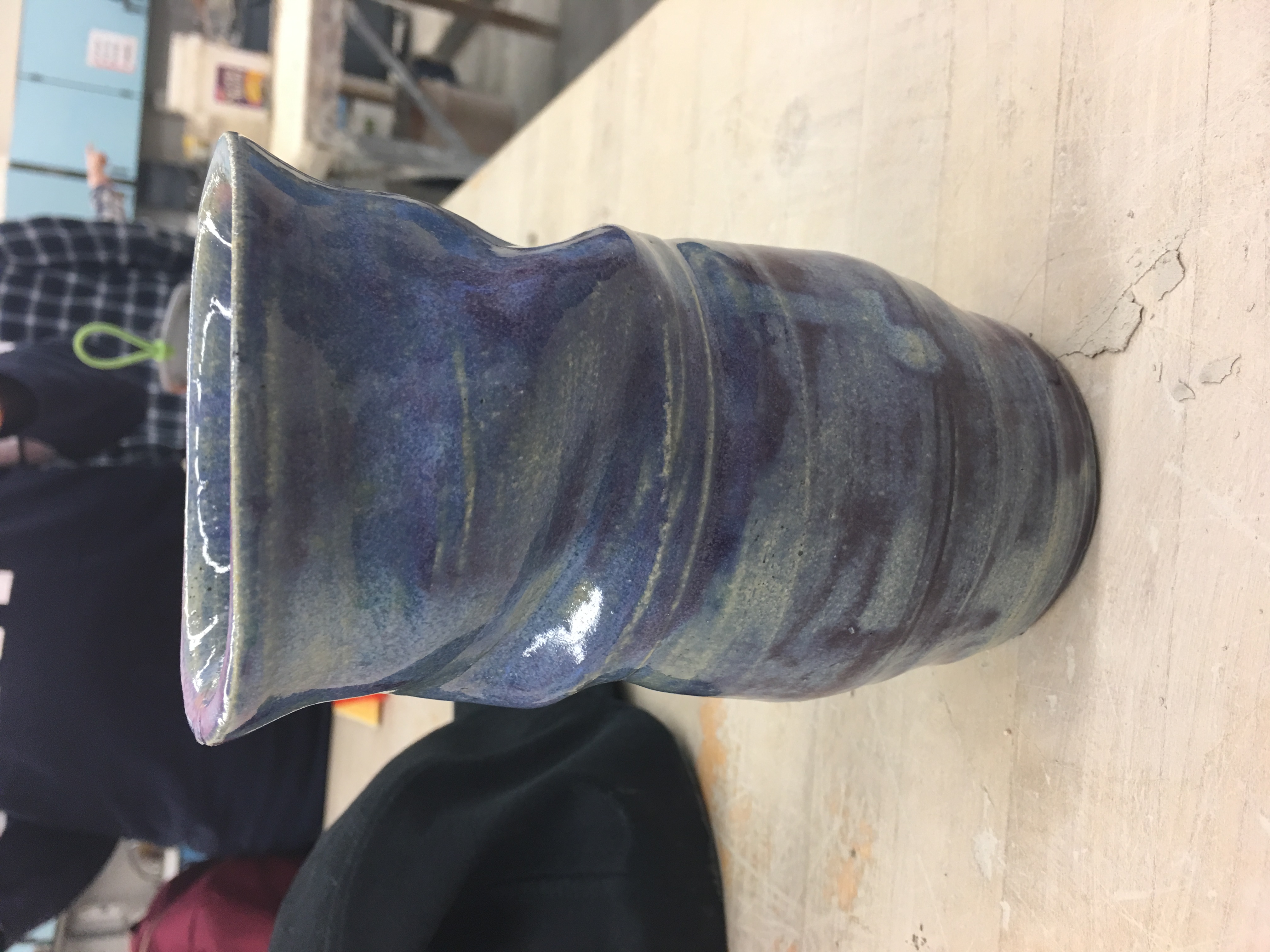 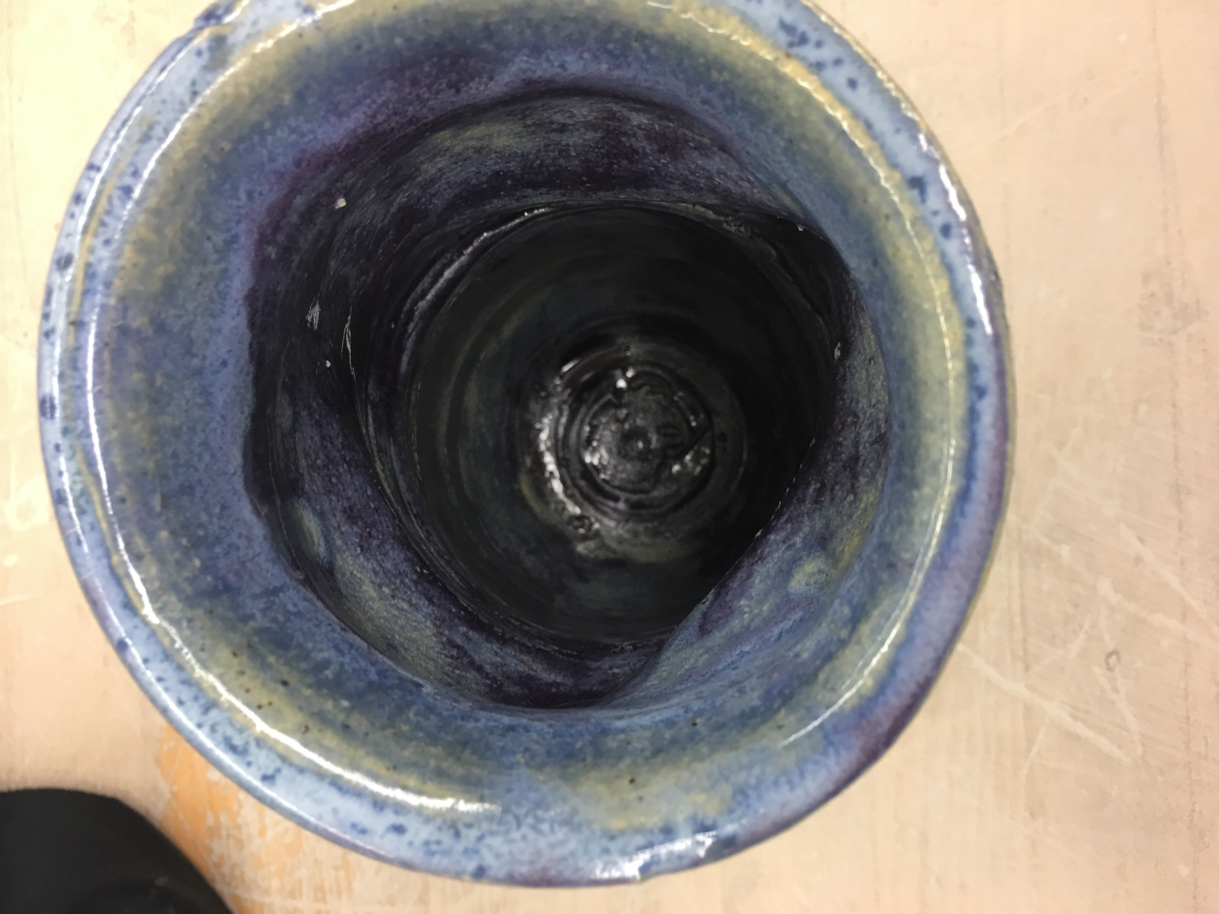 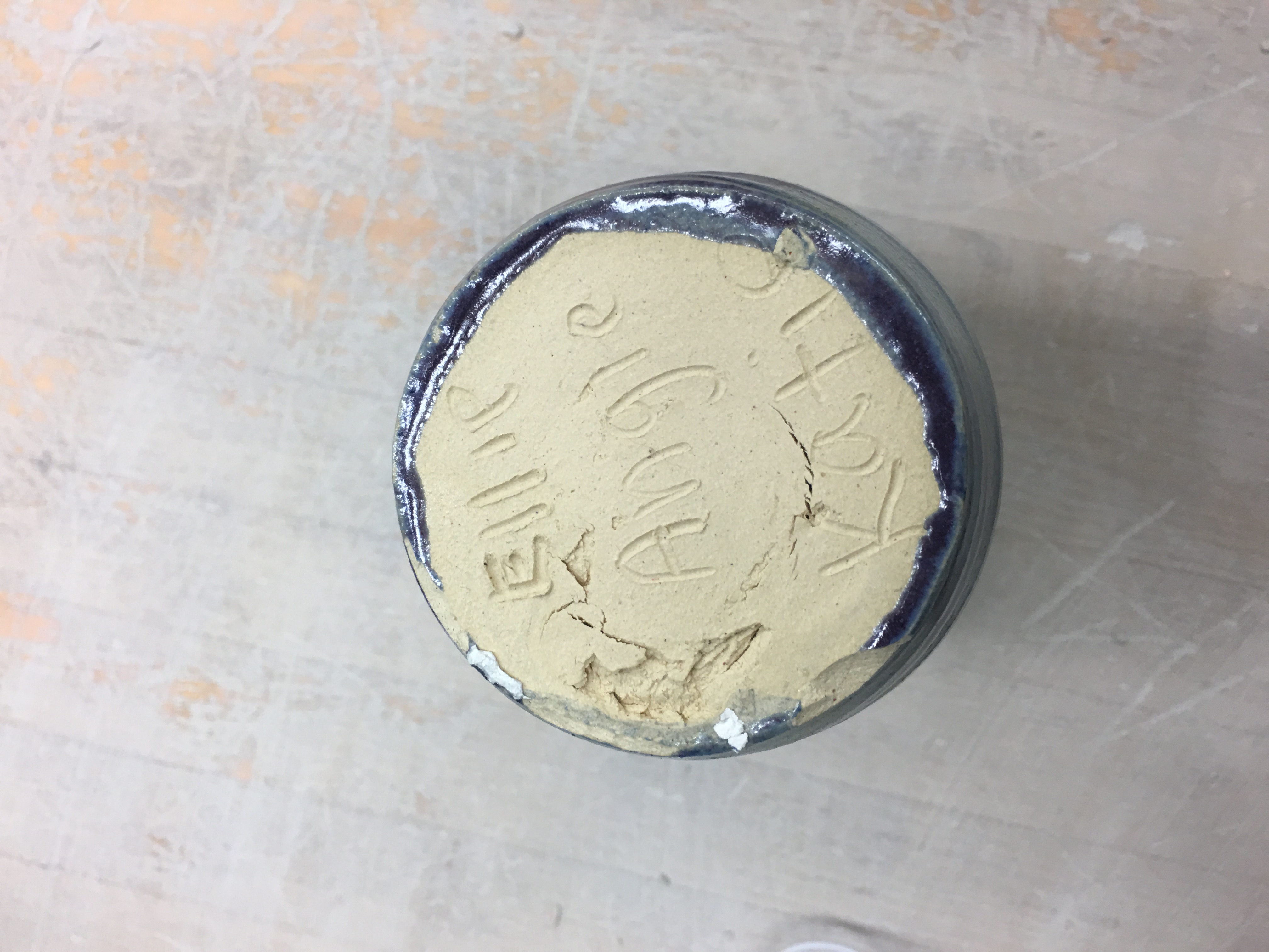
0 Comments
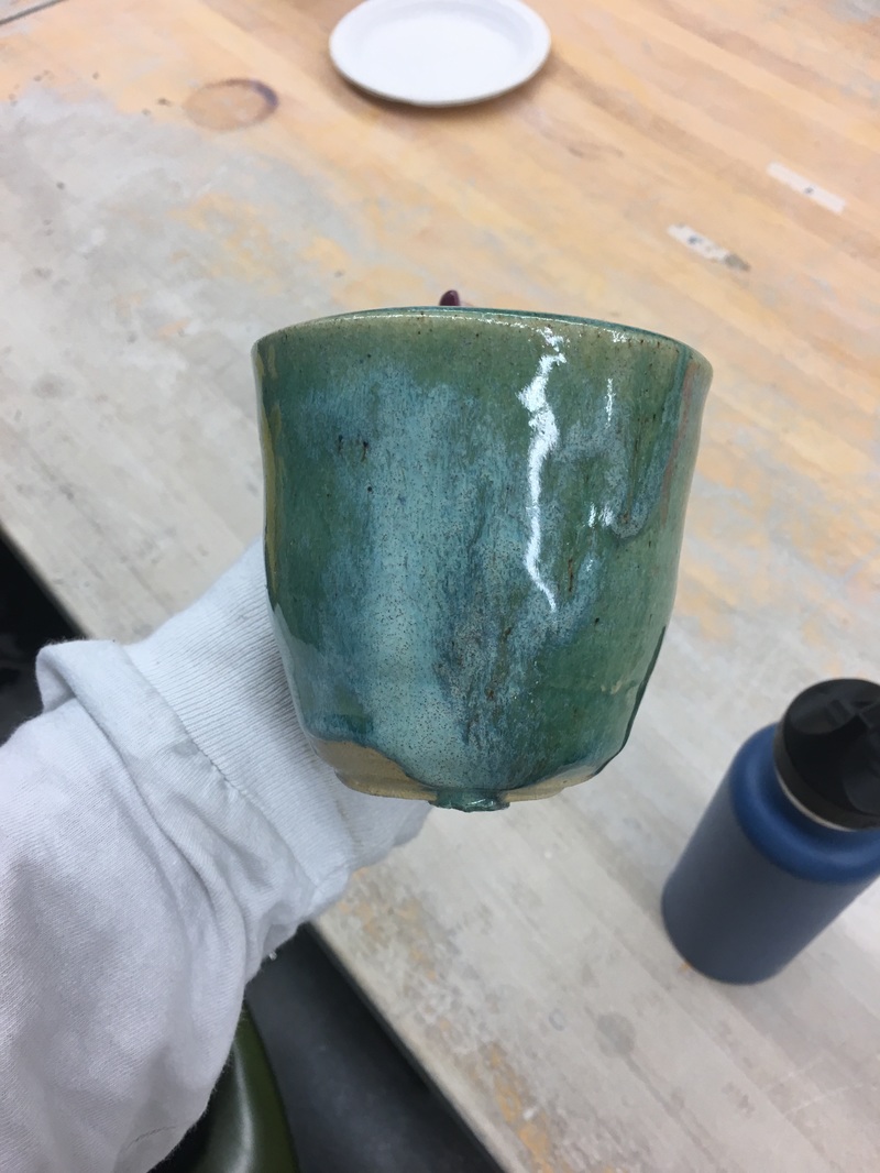
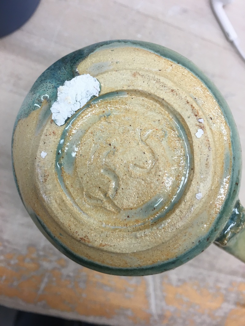
This is my lidded project. It is about 5 inches tall and 3 inches wide. This project was particularly challenging for me because I had to throw 3 different lids to get one that actually fit my vase. However, I really like the color it turned into. The main art element of this project is color with the weird green specs but this goes hand in hand with the design element which is texture because the 3 different glazes gave an appearance of a bumpy texture.  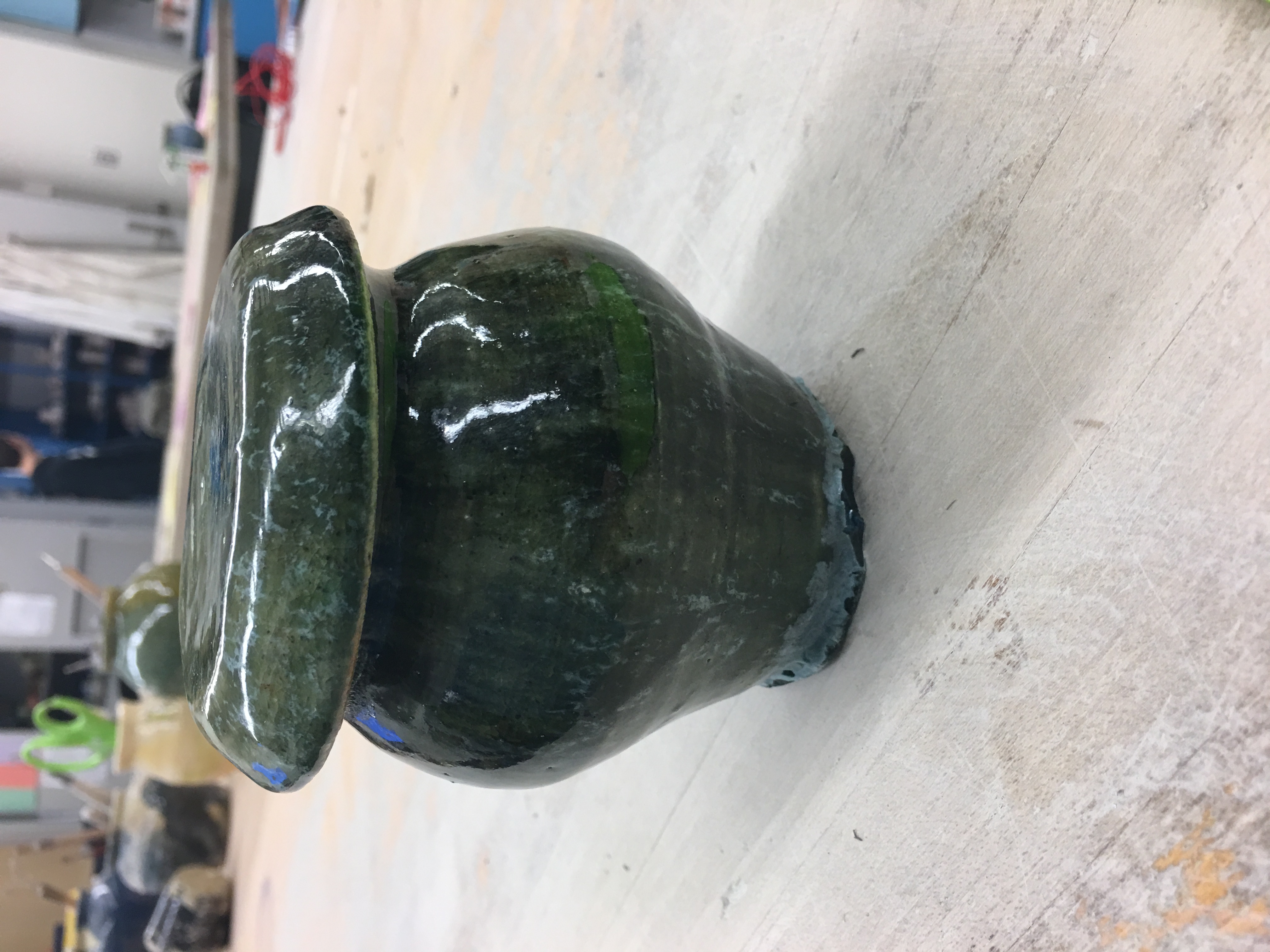  This is my planter project. It is about 3 inches tall and 5 inches wide. The art element that is most prevalent in this project is it's color. I used 3 different glazes on this with matte blue, forest green, and white to create an interesting swirl of colors in the middle of this project. The design element is associated with my art element and that is harmony. The three colors are utilized in different places but they go together well which creates a harmonious project that also has a lot of unity. I think I will try this color pattern again to see how I can switch it around. 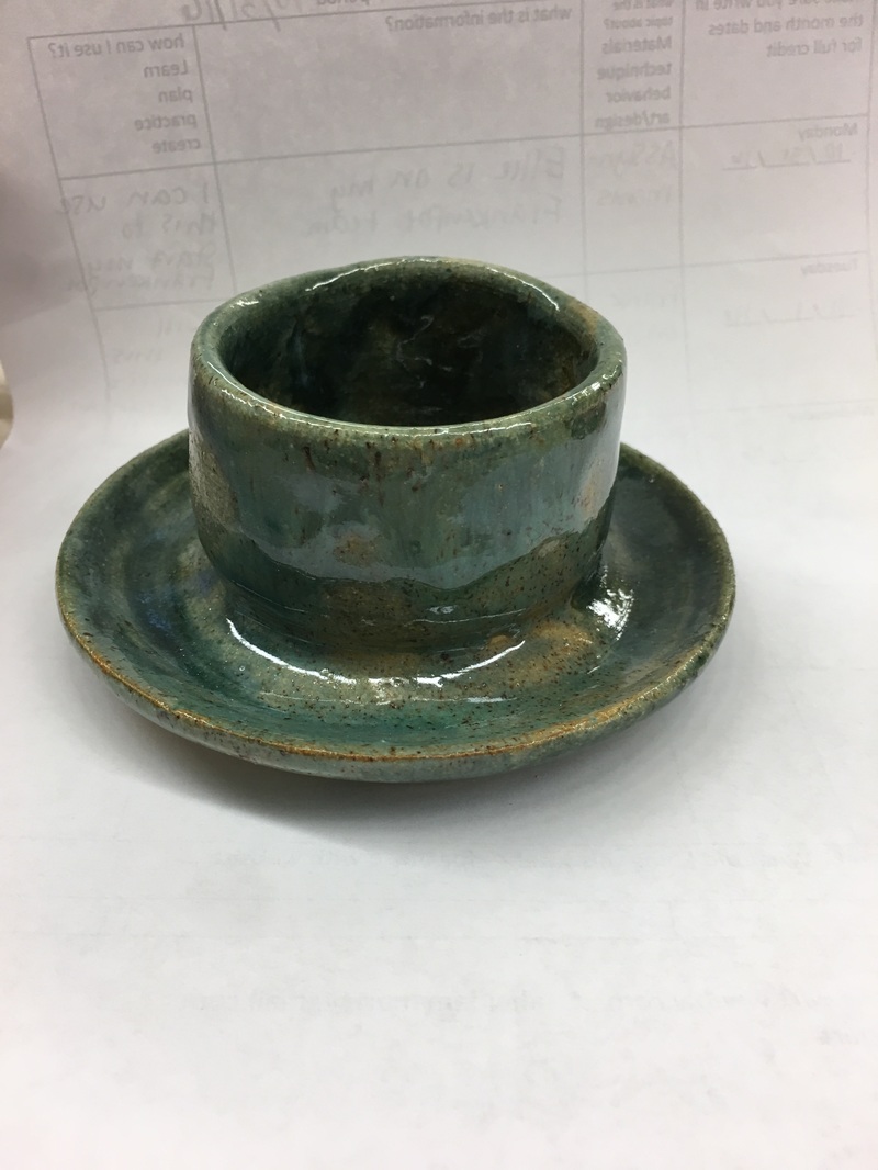 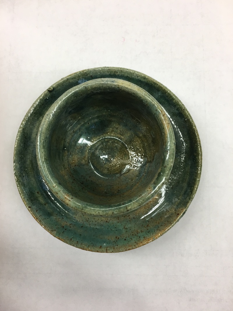 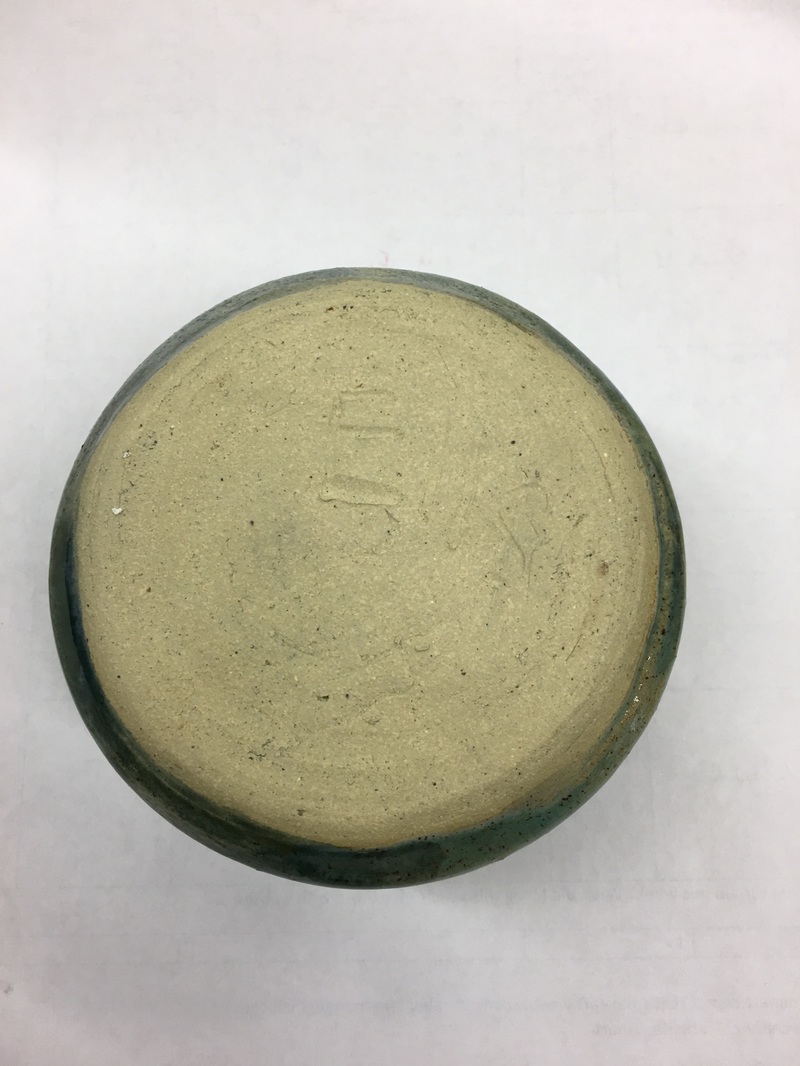 This is my extra credit project, which happens to be a vase. The art element associated with this project is color because that is the most prominent thing about this vase. I tried to do a black and white mixture for this project and it came out with a blue hue, which I loved! The design element with this vase is contrast because the black and white seriously contrast one another but I really like them together. 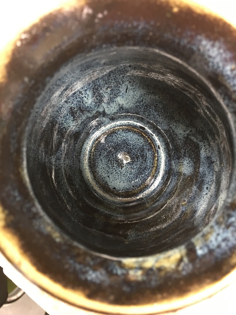 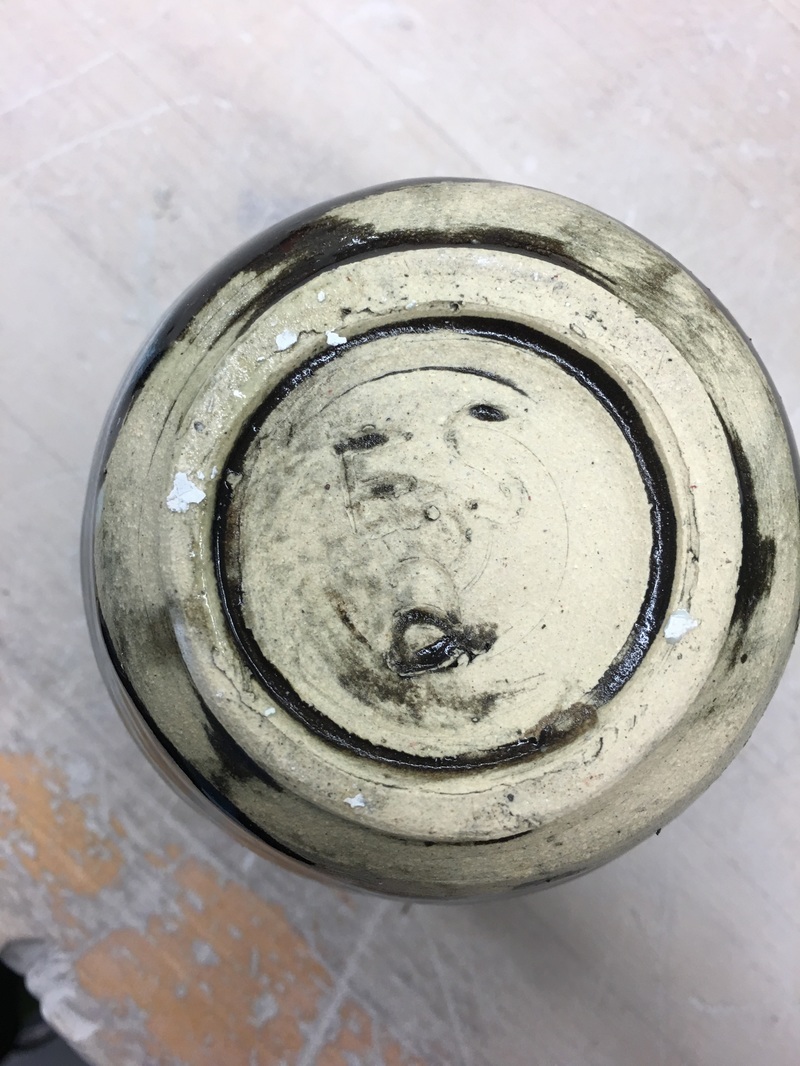 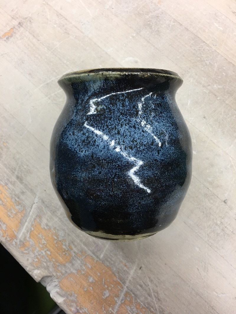 This is my cup and handle project. It is about 5 inches tall and 3 inches wide. With this project, I experimented with sandy glaze with green and I really like it! The color on the side emphasizes movement with the dripping glaze and there is emphasis on that side of the cup. There is harmony and unity with the two glazes as they balance one another out. The skill I reinforced with this project was pulling the handle. 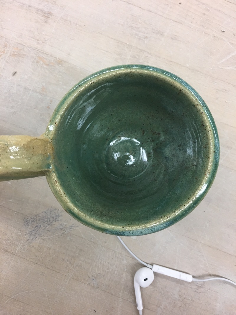
This is my second bowl. It is smaller than my other, standing at about 2 inches high and 2.5 inches wide. The entire project is glazed with a combination of green and sand, but there are alternating shades on the bowl so it has harmony with the different glazes. This bowl also emphasizes on value with the different areas of light and dark. I have never used the sandy glaze before but I like it so far so I will try it again with different combinations on my next projects! 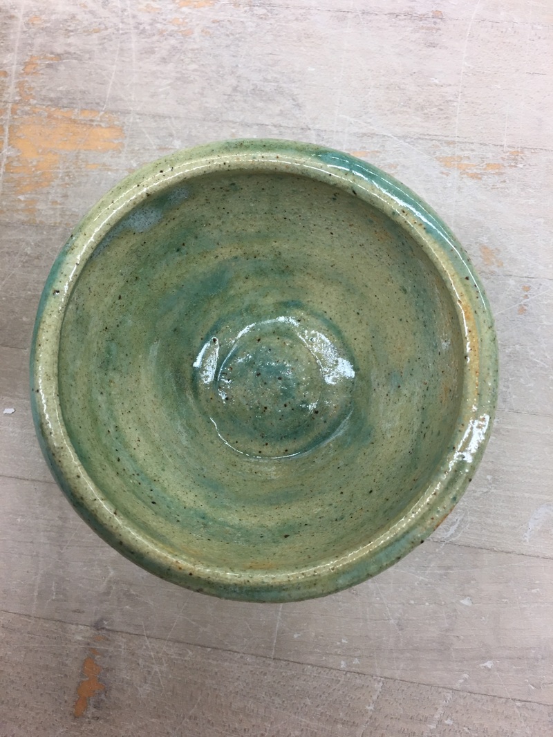 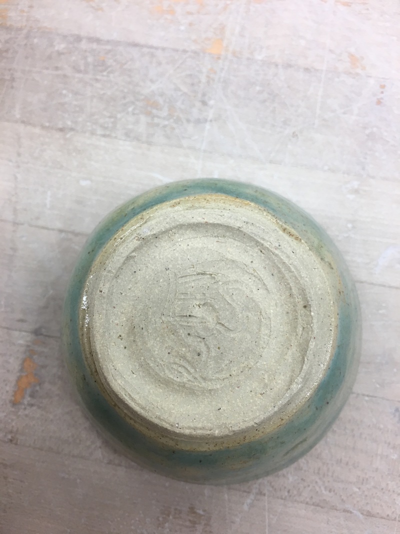 This is my bowl. It is about 4 inches tall and 3.5 inches wide wide. The color that I used defines the lines that I drip glazed. With the use of a bold color and a softer color alternating, it creates contrast but also movement because the colors run down the side to meet in the middle. With this project, I reinforced my skill of using the rib to create the bowl shape.
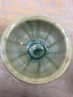
This is my vase. It is about 4.5 inches tall and 3 inches wide. The color of the flowers on the project emphasize pattern. With this project, there is an emphasis on nature with the flowers. This project has kind of a bumpy texture but I think that is important to the nature theme of the project. 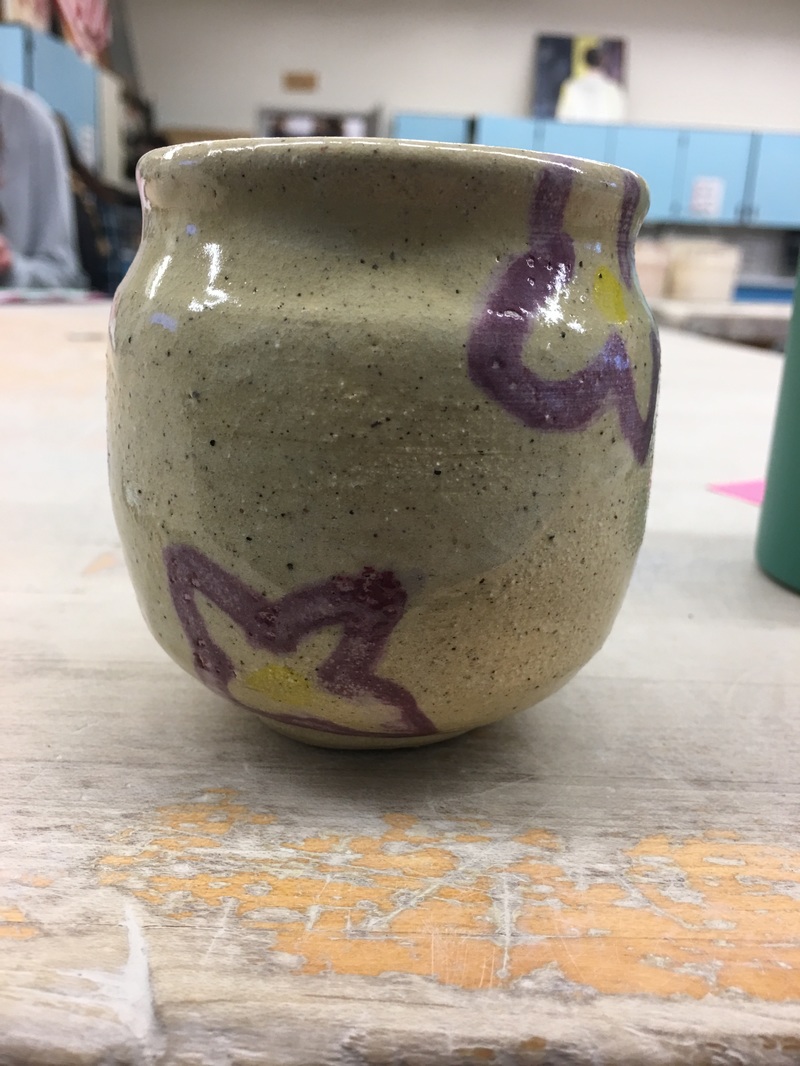 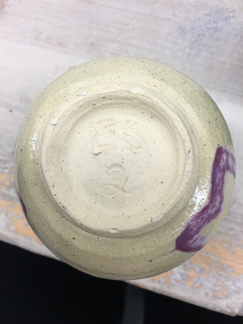  This is my second finished wheel project. For this one, I decided to make a bowl. It stands about 3 inches high and 4 inches wide. The colors I included on it were a white glaze with blue splatter glaze on top. The color of the splatter glaze defines the lines and shape that the random splatters created on the bowl. The splatters emphasize movement on the bowl, which is one of the design elements associated with this project. The skill I reinforced was trimming the lip which gave this project a nice even finish on the top. 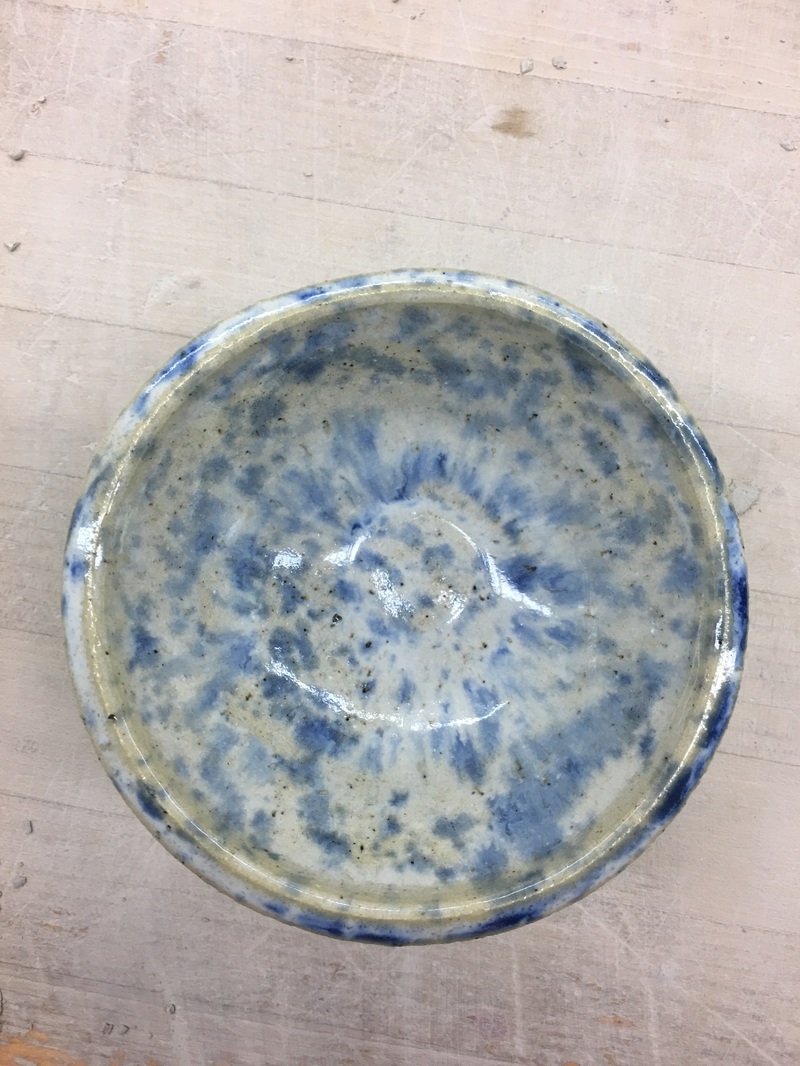 |
AuthorWrite something about yourself. No need to be fancy, just an overview. Archives
January 2017
Categories |
 RSS Feed
